athenahealth Marketplace
The first store where practices could find, judge and request partner apps
athenahealth Marketplace at a glance
athenahealth’s customer-facing store for partner apps, where practices could search, compare and request apps that work with their athenahealth products.
Outcome. Launched, replacing a partner directory on athenahealth.com that was organised by partner type and capability. No usage figures are claimed.
- 1
- designer: me
- 3
- core pages: home, browse, app detail
- 5
- product filters, replacing a field buried in each listing
My roleSole designer · Home, search and browse, and the app detail page · Worked with a product manager, developers and my design manager · Informed by competitor stores, stakeholders and usability testing
Start from the practice
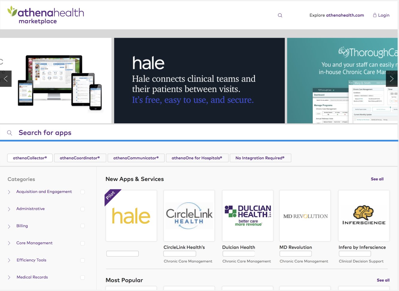
The old directory was organised the way the program was run. The store starts from the athenahealth product a practice already uses.
Judge before committing
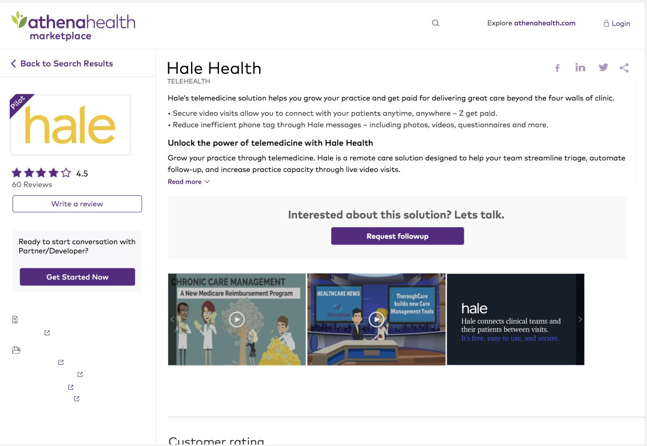
Star ratings, review counts and “Write a review” brought other customers’ experience onto every app.
Room for partners to be seen
A Pilot ribbon and “New” and “Most popular” rows replaced an A–Z grid, so newer and well-liked apps had a place.
Full case study
Problem
- For the business. Partner apps lived in a directory on athenahealth.com that did little to help customers choose or to give partners visibility.
- For users. Practices struggled to find the apps that worked with what they already had, to judge whether an app fit, and to know what other customers thought.
- For the product. A directory organised around the program had to become a store organised around the practice: searchable, browsable, trustworthy, with a clear next step.
Context
athenahealth works with partners whose apps connect to its products, through its More Disruption Please program. Before the store, partners were listed in a Marketplace section of the corporate website.
That directory was organised the way the program was run: tabs by partner type, a long list of capability checkboxes, and cards sorted A to Z. Each listing was mostly the partner’s marketing copy. Which athenahealth product an app needed sat in a details tab inside each listing, and nothing showed what other customers thought.
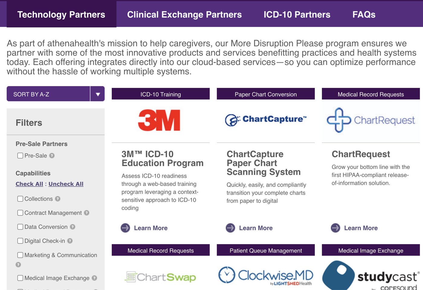
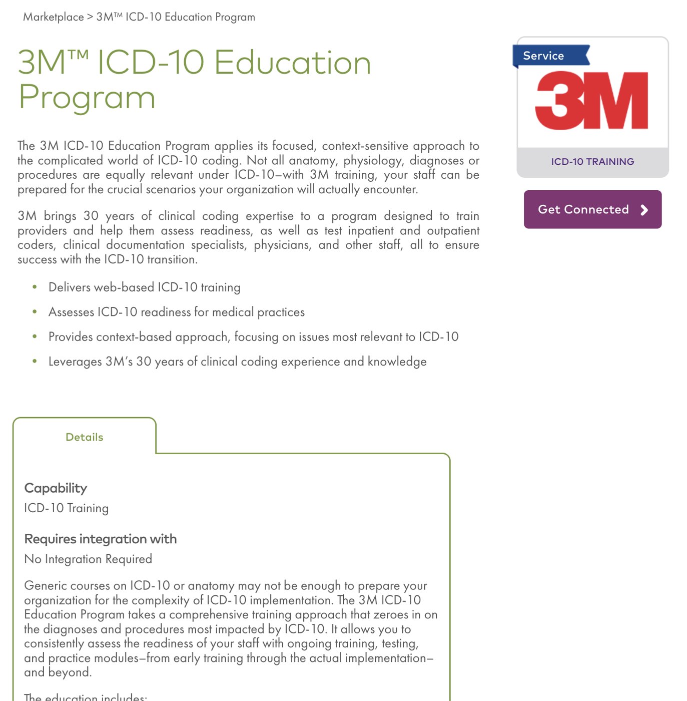
Earlier public pages of athenahealth.com, shown to explain the starting point. Not my design.
| Before: the directory | After: the store |
|---|---|
| Tabs by partner type and capability checkboxes | Filters by the athenahealth product a practice uses, plus categories |
| Required product hidden in each listing’s Details tab | The first filter on the home page |
| Sorted A to Z | “New Apps & Services” and “Most Popular” rows, and a Pilot ribbon |
| Site-wide search only | “Search for apps” at the top of the store |
| Partner marketing copy | Star rating, review count and Write a review on every app |
| Get Connected | Get Started Now beside the rating, and Request followup after the description |
Role
- Role. Sole designer
- Scope. The customer-facing store: home, search and browse, and the app detail page
- Partners. A product manager, developers and my design manager
- Inputs. Competitor app stores, stakeholders and usability testing
- Evidence. The store launched. No usage figures are claimed.
Process
How I approached it
I looked at how other app stores help people browse and decide, worked through the needs of the people running the program, and tested the design with users. Testing led to changes in how search and filters worked.
Key Decisions
- Make “works with what I have” the first filter. The old listings recorded which athenahealth product an app needed inside a details tab. I brought that to the top of the store as filters for each product.
- Help people judge before they commit. Star ratings, review counts and “Write a review” brought other customers’ experience onto every app.
- Keep the next step in view. The old listing already had a Get Connected button. I placed “Get Started Now” beside the rating, where a practice decides, and repeated the offer after the description.
- Give partners visibility. A Pilot badge and “New” and “Most popular” rows gave newer and well-liked apps a place to be seen.
Outcome
The Marketplace launched as athenahealth’s customer-facing store for partner apps. I don’t have usage figures from that time, so none are claimed here.