Paytm Flights
From a one-line brief to a launched flight-booking product, on mobile and web
Paytm Flights at a glance
Flight booking inside the Paytm app and on the web: search, compare, book and pay, then manage the trip afterwards.
Outcome. Launched on mobile and web, and became the base Paytm Trains was adapted from. The search structure I designed is still live in 2026.
- 1
- designer on Travel: me
- 2
- platforms, mobile and web
- 6
- steps in the booking journey
- 4
- developers I handed off to
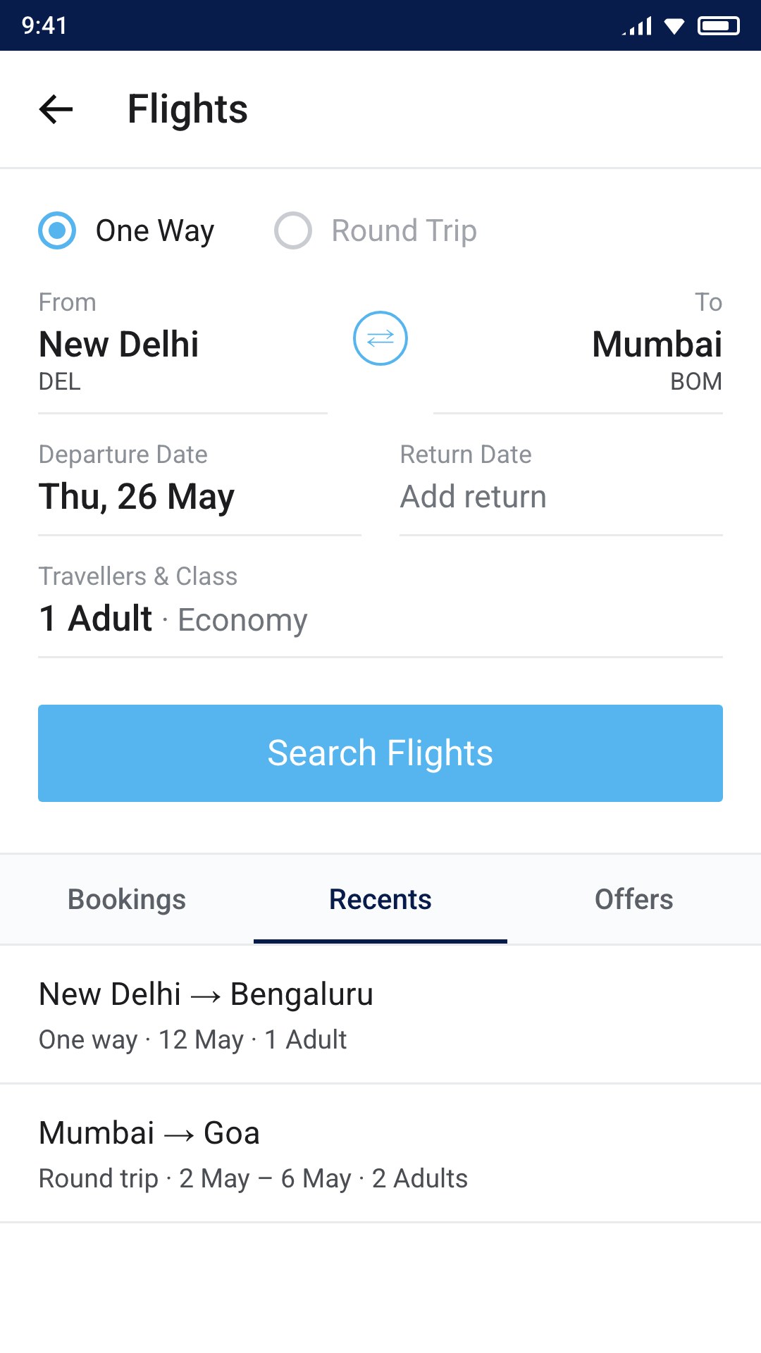
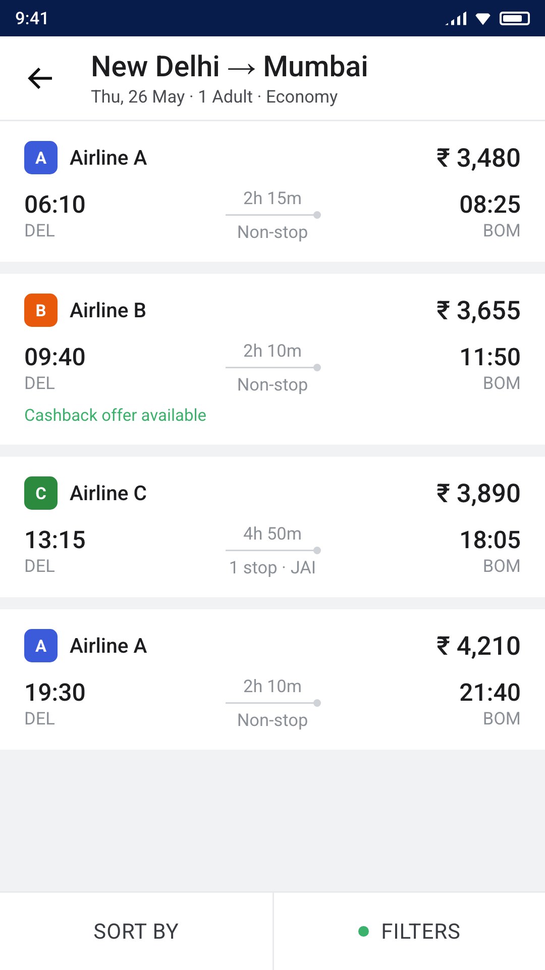
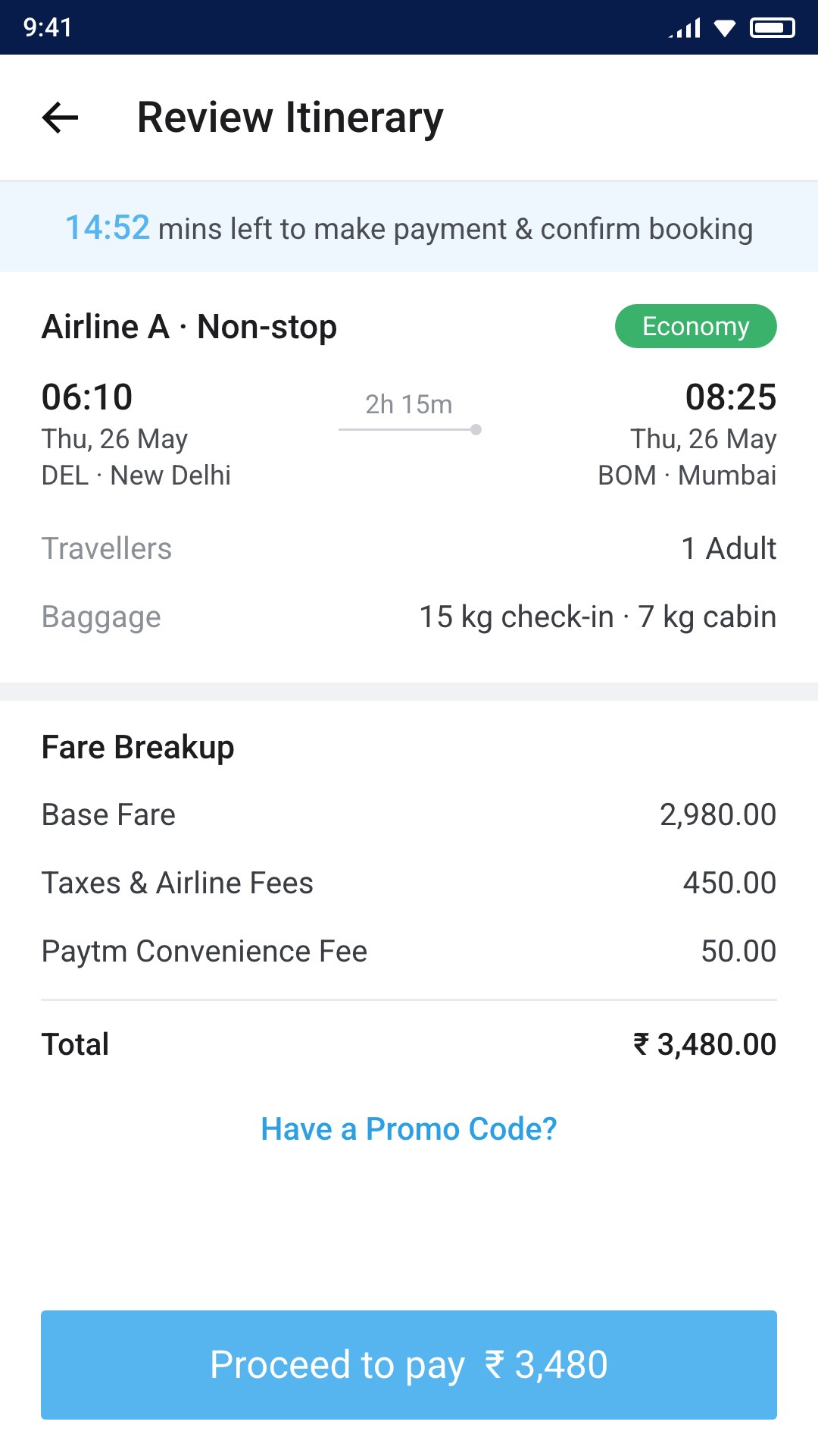
My roleSolo designer for Travel · Defined the product from a one-line brief · Market study and traveller conversations · Flows, visual design and developer handoff for mobile and web
A one-line brief, defined
The brief was “we need a flight booking platform.” I studied booking conventions and talked with travellers before designing a screen.
Trust at payment
A visible time limit to pay, and every fee, including Paytm’s own, shown before payment rather than at the last step.
Unhappy paths designed
No results, an expired promo code, wrong details, a booking limit reached: each had its own designed state.
Screens reconstructed in 2026 for this portfolio. Airlines, prices and people are fictional.
Full case study
Problem
- For the business. Paytm needed a flight-booking product. The brief was one line: “we need a flight booking platform.”
- For users. Everyone was new to booking flights on Paytm: some were new to Paytm itself, others already used its wallet or marketplace.
- For the product. The whole journey had to be defined from scratch: search, results, booking and payment, and managing a trip afterwards.
Context
I joined Paytm in September 2015 as the only designer on Travel. The product manager’s brief was short: Paytm needed a flight-booking platform. Flights would live inside the Paytm app and on the web, so it had to feel like Paytm while working the way travellers expected a booking product to work. Payment and cashback offers ran through the existing Paytm wallet, which the team had agreed from the start.
Role
- Role. Solo designer for Travel
- Scope. Flights, end to end, on mobile and web
- Partners. One product manager and four developers
- My contribution. Market study, interviews, flows, wireframes, visual design and developer handoff
- Evidence. The product launched inside the Paytm app. No usage metrics are claimed.
Process
How I defined it
With so little specified, the first job was deciding what the product needed to be.
- Market study. I studied Cleartrip and similar booking apps to understand the conventions people already knew.
- Conversations. I talked with everyday travellers, product managers, and people who worked in travel about how they search for and book flights.
- Rough flows, reviewed with the PM. I mapped the journey as rough flows and reviewed them with the product manager before any visual design.
- Visual design and handoff. I designed the interface in Paytm’s branding for mobile and web, and handed it to the four developers who built it.
The journey
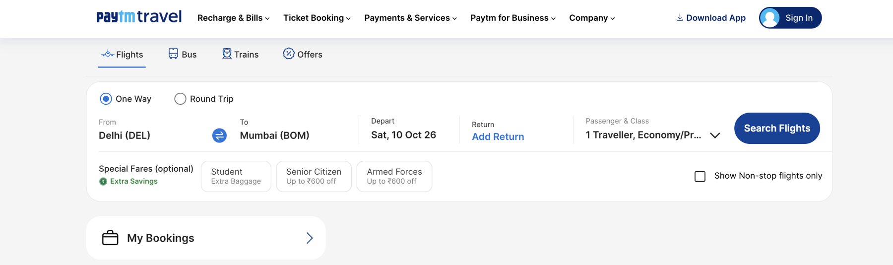
- 1 · Search
- 2 · Pick a city
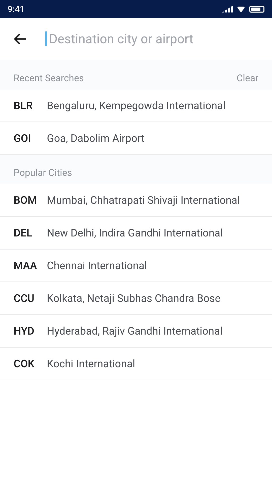
- 3 · Compare
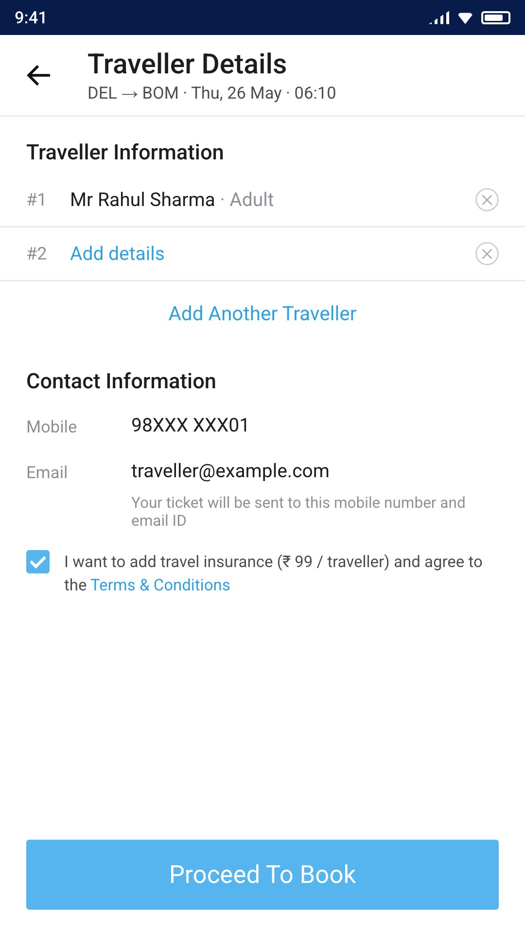
- 4 · Travellers
- 5 · Review & pay
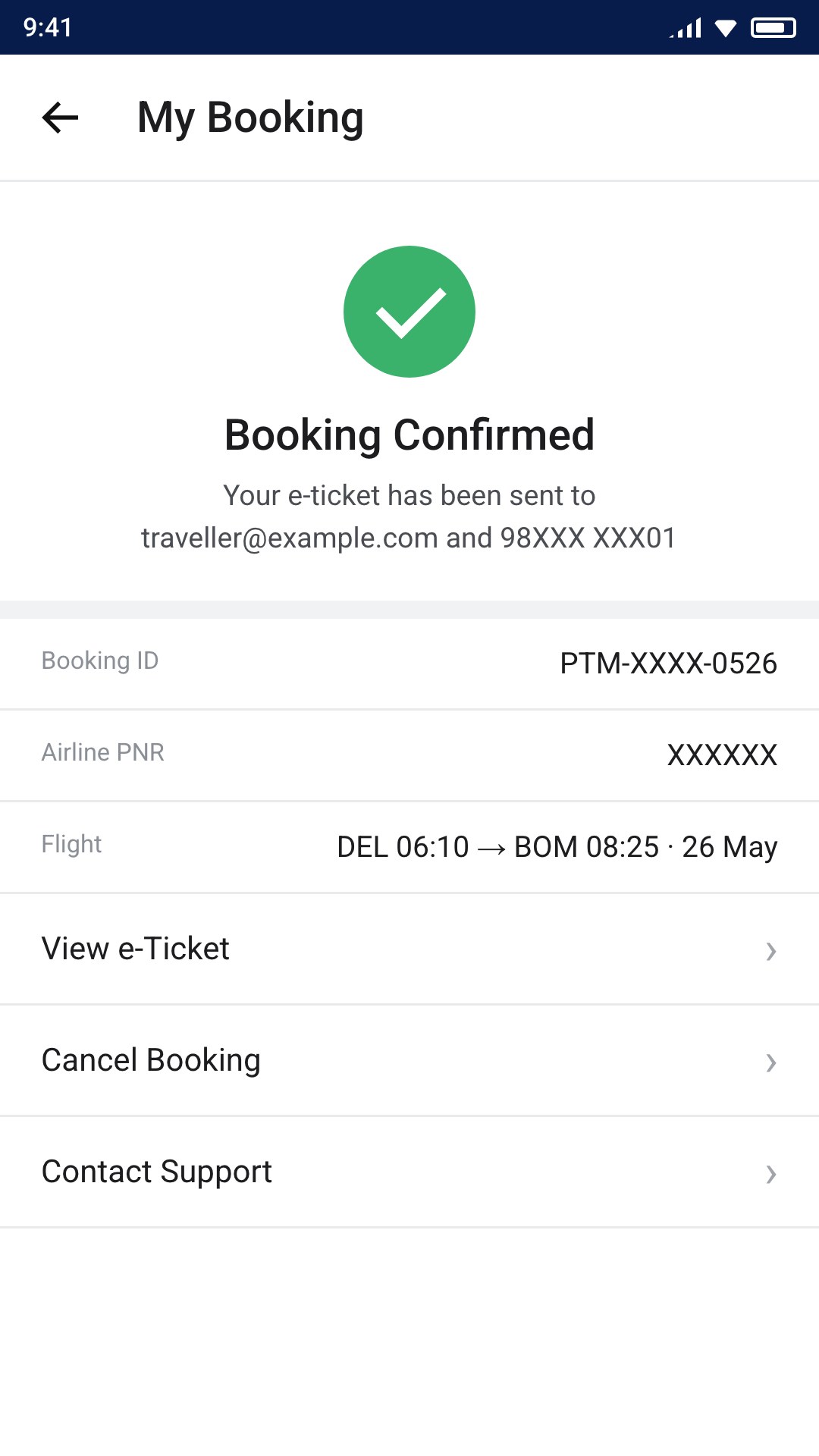
- 6 · Confirmed
Key Decisions
12 3
- 1Show the time limit before payment. The review screen shows how long is left to pay, so people don’t lose a fare they have already chosen.
- 2Show every fee up front. The full fare breakup, including Paytm’s own convenience fee, appears before payment rather than at the last step.
- 3Design the unhappy paths. No results with a way to reset filters, an expired promo code, wrong account details, a booking limit reached: each had its own designed state.
Outcome
Flights launched inside the Paytm app and on the web. The design then became the base for Paytm Trains, which was adapted from it. I don’t have usage or business figures from that time, so none are claimed here.
What I’d change today
Looking back after ten years, these are the decisions I would revisit.
- Contrast and readability. White text on the light-blue buttons and the small grey secondary text fall short of today’s accessibility contrast standards. I would darken the action colour and raise the smallest text sizes.
- No pre-ticked add-ons. Travel insurance was opted in by default. Today I would make it a clear, unticked choice; pre-selected extras erode trust and are no longer acceptable in many markets.
- All-in price earlier. I showed every fee before payment, but results still listed a base price. I would show the total, including fees, on the results screen so people compare real prices.
- The facts people compare on. Baggage, refundability and fare type appeared only after choosing a flight. I would surface them in results.
- A fuller after-booking experience. Web check-in reminders, add to calendar and sharing the itinerary would bring people back between booking and travel.
Lessons
- A short brief is a design problem in itself. Defining what the product needed to be came before designing any screen.
- Trust is built in the details. A visible time limit, every fee shown up front and clear error states matter as much as the main flow when people are paying.
- Design for the next product too. A clear, consistent journey made it possible to build Trains on the same foundation.