athenahealth Website
A component system for the rebranded corporate site, built to turn interest into a conversation
athenahealth Website at a glance
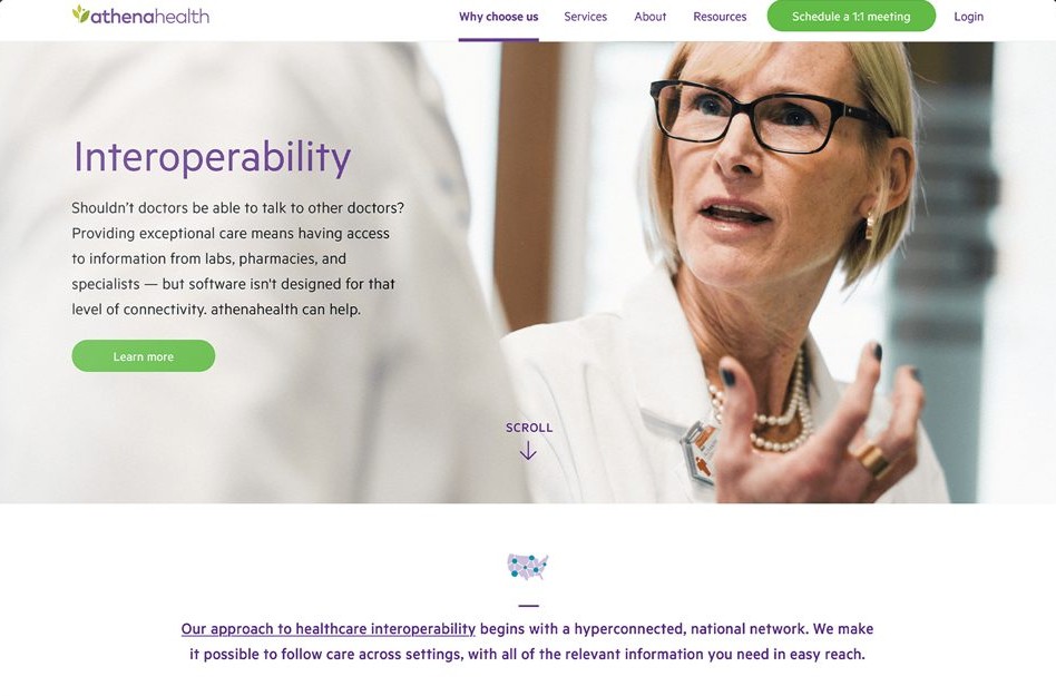
athenahealth’s corporate website, rebuilt after the rebrand as a system of configurable components, with a meeting request one click away on every page.
Outcome. Launched on athenahealth.com as a component system marketing could keep building on. The pages and forms were refined through A/B testing.
- 1
- component system behind every page
- 1
- click to request a meeting, from any page
- A/B
- tested lead-generation forms
- 2
- designers in two time zones, working daily
My roleSenior designer, co-designing with the lead designer · Page structure and visual design · Configurable components and the style guide · Lead-generation forms, tested with A/B experiments · Production and QA through launch
Pages from building blocks
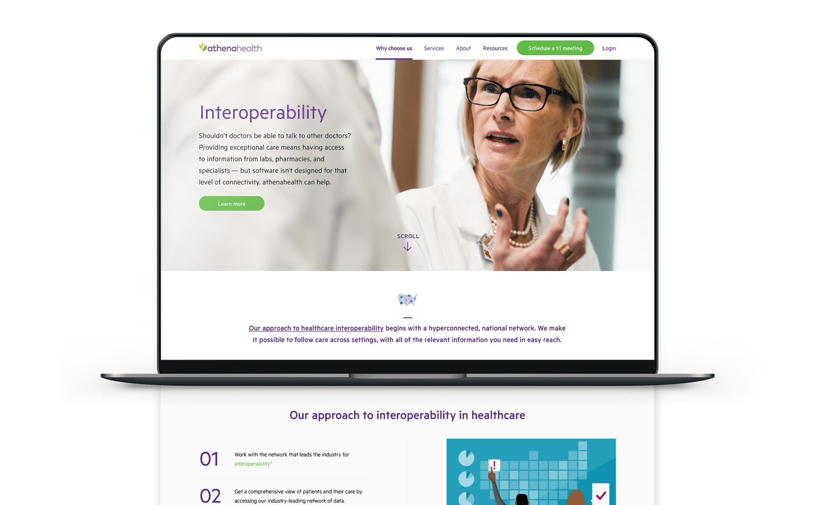
Heroes, numbered steps, feature rows and calls to action, reused across solution pages on desktop and mobile.
A meeting, one click away
A Schedule a 1:1 meeting button in the navigation on every page, and short forms refined through A/B tests.
The same parts on mobile
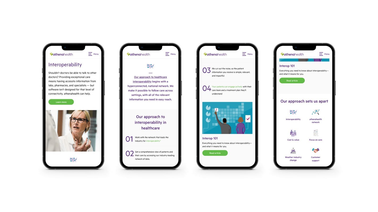
Each component had a mobile behaviour in the style guide, so pages didn’t need separate mobile designs.
Mock-up images by Jen Magathan, used with permission.
Full case study
Problem
- For the business. After the rebrand, the corporate site had to tell one story in one voice across solutions, services and audiences.
- For the team. Marketing needed to publish new pages quickly without a designer drawing every one, while staying on brand.
- For sales. The site’s job was to turn interest into a conversation. Every page needed a clear, low-effort way for a practice to ask for a meeting.
Context
athenahealth rebranded, and its corporate website was rebuilt around the new identity: a purple-and-green palette, warm illustration and real clinicians in photography. Rather than designing pages one by one, the site was set up as a system of configurable components with a style guide behind it.
Role
- Role. Senior designer, co-designing with the lead designer
- Scope. Corporate website pages on desktop and mobile, and the lead-generation forms
- Collaboration. Two designers in two time zones, working together every day, with marketing and web development
- My contribution. Page structure, visual design, configurable components and the style guide, the lead-generation forms, and production and QA as pages were built
- Evidence. Launched on athenahealth.com
Process
Design the parts, then the pages
We started from the components rather than the pages: a hero, an intro statement, numbered steps, feature rows with illustration, content cards and calls to action. Each had rules for spacing, type and colour in the style guide, so a new page was an arrangement of known parts. Working across two time zones meant a daily handover: one of us picked up where the other stopped, which kept the system consistent because we were always reviewing each other’s work.
Turning interest into a conversation
For a B2B healthcare company, the website’s most important action is a practice asking to talk. A green Schedule a 1:1 meeting button stays in the main navigation on every page, so the next step is never more than a click away.
I worked on the lead-generation forms behind those calls to action. A form sits at the point where interest can turn into a sales conversation or quietly drop off, so I treated it as a design problem in its own right: asking only what sales needed to follow up, keeping it short, and making each field and error clear. We refined the forms through A/B testing and watched the results in Google Analytics, keeping the versions that performed better.
Built, checked, shipped
As pages were built, I reviewed them against the designs and the style guide on desktop and mobile, and fed fixes back to development until they matched.
Mock-up images by Jen Magathan, used with permission.
Key Decisions
- Components before pages. A small set of configurable blocks with clear rules let the team build new pages without new design each time, and kept the rebrand consistent.
- Keep the next step on every page. The Schedule a 1:1 meeting call to action sits in the main navigation, and the forms behind it were refined through A/B tests rather than guesswork.
- Design for mobile with the same parts. Each component had a mobile behaviour defined in the style guide, so pages didn’t need separate mobile designs.
Outcome
The redesigned site launched on athenahealth.com as a component system that marketing could keep building on. The refined pages and forms contributed to higher engagement and lead generation, measured through A/B tests and Google Analytics. I don’t have the figures from that time, so none are quoted here.
Lessons
- A system outlives its first pages. The value was less in any one page than in how easily the next one could be made.
- Test the moment that matters most. The form is where interest becomes a lead, so it deserved experiments, not opinions.
- Co-design works when the handover is daily. Two time zones became an advantage once each day ended with a clear hand-off.