Knowledge Hub
An editorial home for healthcare insight, browsed by topic
Knowledge Hub at a glance
The editorial home on athenahealth.com for research and industry insight: articles, infographics, interactive tools, quizzes and photo essays.
Outcome. Launched on athenahealth.com, with more than 300 pieces of content moved in from athenaInsight.com.
- 300+
- articles, tools, quizzes and photo essays
- 6
- topics readers browse by
- 1
- editorial frame for every format
- 2
- designers in two time zones, working daily
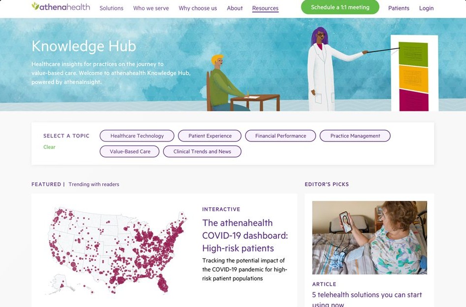
My roleSenior designer, co-designing with the lead designer · Page structure and visual design · Editorial components · Production and QA through launch
Browse by topic, not by format
Six topics sit above the content, so a reader looking for patient experience finds articles, tools and quizzes together.
Know what you’re opening
Every card carries a format label and reading time, across very different kinds of content.
A home for 300+ pieces
Research and insight from athenaInsight.com moved in, each piece tagged with a topic and a format.
Mock-up images by Jen Magathan, used with permission.
Full case study
Problem
- For the business. athenahealth’s research and industry insight lived on athenaInsight.com, which was being retired. Its content needed a new home that kept its value.
- For readers. Practice leaders and clinicians came for insight on a subject, not a content format. A library of articles, infographics, tools and quizzes had to be easy to browse by what they cared about.
- For the editors. Very different kinds of content had to sit together without a separate template for each.
Context
athenaInsight.com was athenahealth’s editorial site for research and industry insight. When it was sunset, its articles, infographics, interactive tools, quizzes and photo essays needed a new home on athenahealth.com. That became the Knowledge Hub, under Resources in the main navigation.
Role
- Role. Senior designer, co-designing with the lead designer
- Scope. The Knowledge Hub landing page, topic pages and content cards, on desktop and mobile
- Collaboration. Two designers in two time zones, working together every day, with the editorial team and web development
- My contribution. Page structure, visual design, the editorial components, and production and QA
- Evidence. Launched on athenahealth.com; more than 300 pieces of content moved in
Process
Topics as the front door
Readers arrive with a subject in mind: patient experience, financial performance, value-based care. So the Hub opens on six topics rather than on content types, with what’s featured and trending below and editor’s picks alongside.
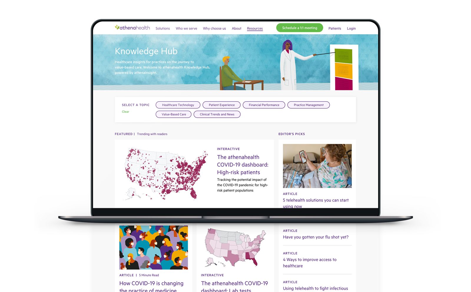
One frame for every kind of content
The Hub held very different things: long articles, data-driven interactives, quizzes and photo essays. Instead of a template per format, it uses one editorial frame. Every card carries a format label (Article, Interactive) and a reading time where it helps, so the reader knows what they’re opening before they click.
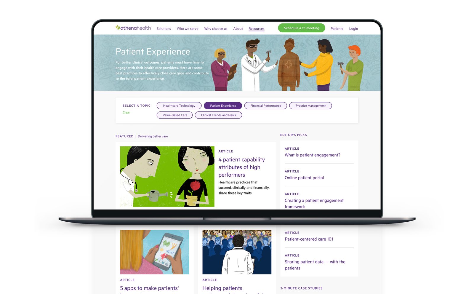
Moving the library in
More than 300 pieces came across. Because every piece fitted the same frame, moving them was a matter of tagging each with a topic and a format rather than redesigning it. I reviewed pages as they were built, on desktop and mobile, and fed fixes back to development.
Mock-up images by Jen Magathan, used with permission.
Key Decisions
- Browse by topic, not by format. Six topics sit above the content, because readers come for a subject.
- Label the format on every card. Article, Interactive and reading time set expectations before the click, across very different content.
- One editorial frame. A single set of cards and page layouts held every content type, so new pieces could be published without new design.
- Inside the main site. The Hub lives under Resources in athenahealth.com’s navigation, so insight sits next to the product story.
Outcome
The Knowledge Hub launched on athenahealth.com, and more than 300 articles, infographics, interactive tools, quizzes and photo essays moved into it. I don’t have traffic or engagement figures from that time, so none are claimed here.
Lessons
- Organise around what readers came for. Topics, not formats, made a mixed library browsable.
- A shared frame makes a migration manageable. When every piece fits one structure, moving hundreds of them is tagging, not redesign.